
Choosing the perfect paint color coordination when you’re building a new home or updating your paint choices for your existing home can be overwhelming. How do you pick paints that are color coordinated and aesthetically pleasing at the same time? You might now know it, but there’s a science to which colors and tones complement each other and which ones don’t. So, let’s talk about some things to be mindful of when choosing a color scheme. We’ll also go over how to use the color wheel to guide you to your desired outcome.
Live in Sacramento and need professional painters? We’ll give you a free estimate. We serve the whole area including Davis, El Dorado Hills, Stockton, and Vineyard.
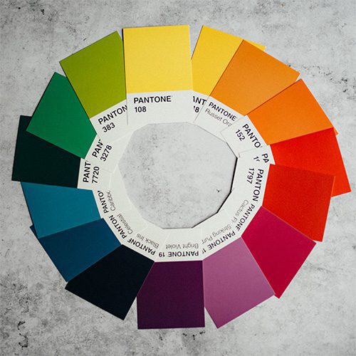
Color Coordination With The Color Wheel
We all studied the color wheel back in middle school art class. But, maybe we didn’t realize at the time what a helpful tool it could be in pairing interior and exterior paint colors together. The color wheel is essentially divided into two parts. A warm side and a cool side. In general, the warm side tones of orange, red, and yellow, generate energy, warmth, and passion. The cool side hews such as green, blue, and purple, tend to create a sense of tranquility and calmness. You can use the different color combinations and patterns of the color wheel to help you choose colors that intrinsically work well together. The basic color combinations are as follows:
-
Complementary Colors
Complementary colors are pairs of colors directly across from each other on the color wheel. These colors, when mixed or combined together, cancel each other out by creating either white or black. In the case of complementary colors, opposites attract. This color scheme results in a high contrast that is bright and really pops. These combos are bold so you have to be careful not to go crazy or your result will appear too loud. Red and green, orange and blue, yellow and purple are all examples of complementary color combos. It makes sense why sports teams choose these energetic and bold combinations as a winning formula for their representation.
-
Triadic Colors
Triadic color schemes are found by drawing an equilateral triangle on the color wheel which means each color is evenly spaced apart. The two most well-known combos are the primary colors, red, blue, and yellow, and the secondary colors which are orange, purple, and green. Typically, one color of the three will be dominant while the other two work as accents.
-
Analogous Colors
Analogous color combinations are groups of three that are found on any given side of the color wheel. Tones often found in nature, create a sense of harmony and serenity that is pleasing to the eye. This color scheme lends to a monochromatic look with depth and richness.
Popular Paint Colors and How To Use Them
With the science of the color wheel on our side, let’s walk through some of the most popular paint colors on the market today and the do’s and don’t with each particular shade. Neutral tones typically make for the most popular colors but paying attention to the undertones will steer you away from unsightly matches.
-
Agreeable Gray by Sherwin-Williams SW7029
Agreeable gray is a luxurious neutral paint color by Sherwin-Williams. Honestly, this color is so versatile that there isn’t a shade it doesn’t compliment. Its base is gray with a hint of beige. It tends to appear warmer in bright lighting and a little grayer in cool lighting or darker spaces. Now that warmer gray hews are on the rise when it comes to popularity, Agreeable Gray is in its prime! Because of its warm undertones, agreeable gray coordinates nicely with Sherwin-Williams’ Extra White, Coral Rose, and Incredible White.
-
Urbane Bronze by Sherwin-Williams SW7048
Despite its dark appearance, Urbane Bronze is actually a very dark gray with bronze undertones, giving it a luxurious and sophisticated feel. In certain lighting, it can look dark brown, murky gray, or even give off a green sheen. A bold neutral, Sherwin-Williams pairs it with Extra White, Ivoire, and Shaji White.
-
Repose Grey by Sherwin-Williams SW7015
Repose Grey bears some resemblance to Agreeable Gray and they both work in virtually any room in your home. It’s a warm gray that pulls cool in certain lighting. The slight blue and very light purple undertones can make it look a little cooler than some other greige colors. But, Repose Gray is overall a warm gray because its brown undertones overshadow the hints of blue. People love repose grey and use it to paint everything from kitchen cabinets, bathrooms, and living spaces, to their exterior siding and brick. Sherwin-Williams recommends pairing with Paverstone, Coral Clay, and Elder White.
-
Revere Pewter by Benjamin Moore HC-172
We’re all aware that there are endless colors of gray paint available on the market. But, not all grays are created equally. There are warm greys, cool greys, grays that look blue, grays that look green, and so on. Revere Pewter is one of the top-selling grays out there mainly because of its versatility and warm undertones. The great thing about this color is that you can pair it with warm and cool colors alike. White Dove by Benjamin Moore is the perfect compliment to Revere Pewter.
-
Mindful Gray by Sherwin-Williams SW7016
Mindful Gray is another neutral favorite and a bit different than the other greige hews. While mindful gray is a warm color, it has hints of green and sometimes taupe undertones. In a dark room, the green is more prominent. The more natural light in your room, the warmer the gray will appear. Wood tones will also add to the strong green undertone of Mindful Gray. The paint colors that are suggested by Sherwin-Williams to compliment Mindful Gray are Pearly White, Homburg Gray, and Elder White.
-
Hale Navy by Benjamin Moore HC-154
There is just enough navy in Hale Navy to give it the perfect amount of depth without any green undertones. Even though navy is considered a cool color, this particular color pairs well with both warm and cool tones. Hale Navy is used time and time again because it simply goes well with everything. Because it can appear almost a charcoal gray in darker lighting and smaller spaces, you can even pair it with black paint and be thrilled with the results.
When you want to be bold and stand out, try painting the exterior of your home Hale Navy. You might worry about going with a dark color for your exterior since they’ve been known to fade over time. But, paint has come a long way and most paint comes with up to 15 years’ worth of protection without having to pay to have it upgraded. Since navy looks so good against white or cream trim, some suggested color pairings could be Wish, Gray Owl, or Woodmont Cream.
-
Manchester Tan by Benjamin Moore HC-81
If you’re looking for a warm, neutral beige wall color, your search stops with Manchester Tan. It’s timeless and far from boring. Lighting, color contrast, and furnishings will all play a part in knowing if this color is right for your space. While it’s neutral with a yellow base, it does have a very subtle green undertone. Be careful when pairing with colors harboring pink or red undertones. Consider Woodlawn Blue or Guilford Green as nice pairing colors to Manchester Tan.
-
Navajo White by Sherwin-Williams SW6126
Not a stark white, Navajo White is a warm, cream color with yellow and beige undertones. Some people are afraid to use it in their homes as the current trends lean toward the cooler tones of blues and greys. Reds, browns, and taupes were all the rage in the ’90s and early 2000s. If you want to temper down the warmth of the yellow undertones, try pairing it with a medium-toned gray. The cool gray will tone down the Navajo White while complimenting it at the same time. By bringing together opposites, you bring depth to your space and keep it from becoming monotone. Colors that compliment Navajo White nicely are Row House Tan, Rita’s Rouge, and Creamy.
Color Coordination Conclusion
If you’re considering painting the interior or exterior of your Sacramento area home but have questions about colors, give PaintRite Pros a call. Our trained experts will be happy to give you a free color consultation and go over all your options. We understand the value of what it means every time someone chooses a painting contractor. That’s why we try our absolute best to ensure you’re happy with the finished product. We also have people who speak Espanol if you prefer that as well.
Tags: color coordinated, color coordination